© Six Day Berlin
Six Day Berlin Track Race Event
ABOUT THE PROJECT
A digital spectator experience enhancing the engagement
all year
As three UX/UI designers, Arvid, Roberto, and I are cycle enthusiasts. We collaborated brilliantly on a sizeable project that allowed us to divide and conquer. I love track cycling and was fortunate to win Valts Miltovics, CEO of Six Day Berlin, for this 5-week project. It became a  project.
MY ROLES
UX Research
UX Design
UI Design
Animated Prototype
DURATION & DATE
5 weeks, June 2022
TEAM
Carla Eckhard
Arvid van de Reep
Roberto Terraciano
DELIVERABLES
App prototype
Design System
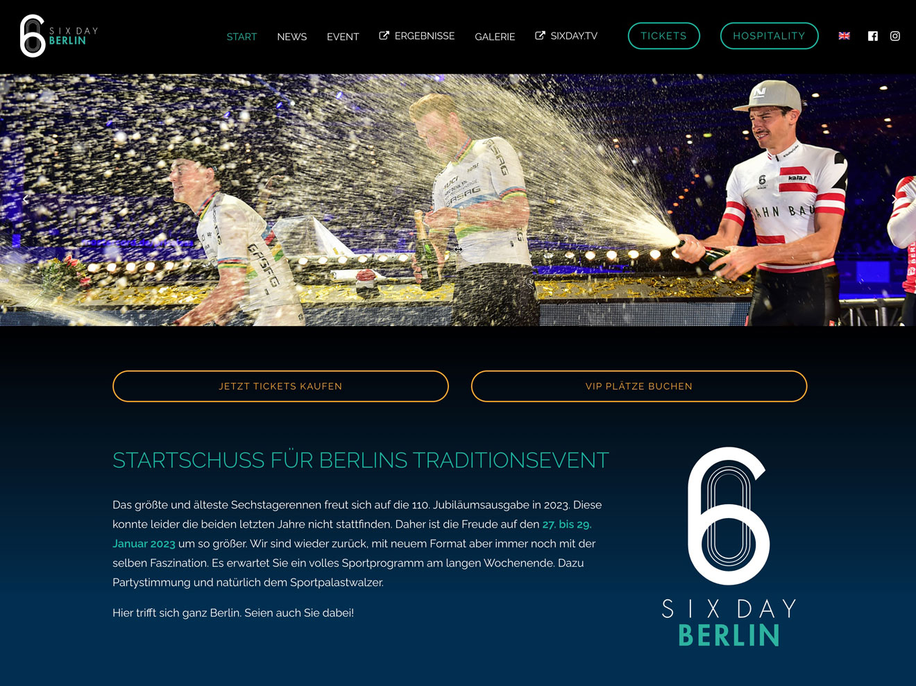
Six Day Berlin is the most known track cycling event that lasts 3-6 days. Blending world-class track cycling and entertainment in one event it's a unique occasion not to be missed for cycle race enthusiasts. The company asked us to provide an accessible and delightful event experience. The main goal of that tool was to keep users engaged in the event.
Get on track with our design journey of gearing up with reality outside and on the screen.
Six Day Berlin is a heavily analogue-driven event. Once the event concludes it loses connection to its audience and the cycling community at large. Its online presence is limited to ticket sales offering little in terms of information or engagement.
Visitors interested in learning about 15+ race disciplines, race rules, and race teams find it difficult to navigate the niche sport and keep up with daily vivacious events happenings. How can we enhance the online experience and effectively showcase the excitement of the event?
We collaborated closely with Valts Miltovics (CEO of Six Day Berlin) to shape Six Day Berlin's product vision and mission:
"Creating a gateway that turns users into early adopters who become ambassadors and which fosters engagement and loyalty."
Welcoming the reality outside the screens we set out to bring peace to users with the events that might happen on screen. We developed an app to provide users with insights into race rules and race disciplines, as well as the opportunity to engage with Berlin's vibrant cycling community. The project was big enough for each one of us to create and engage in each development step.
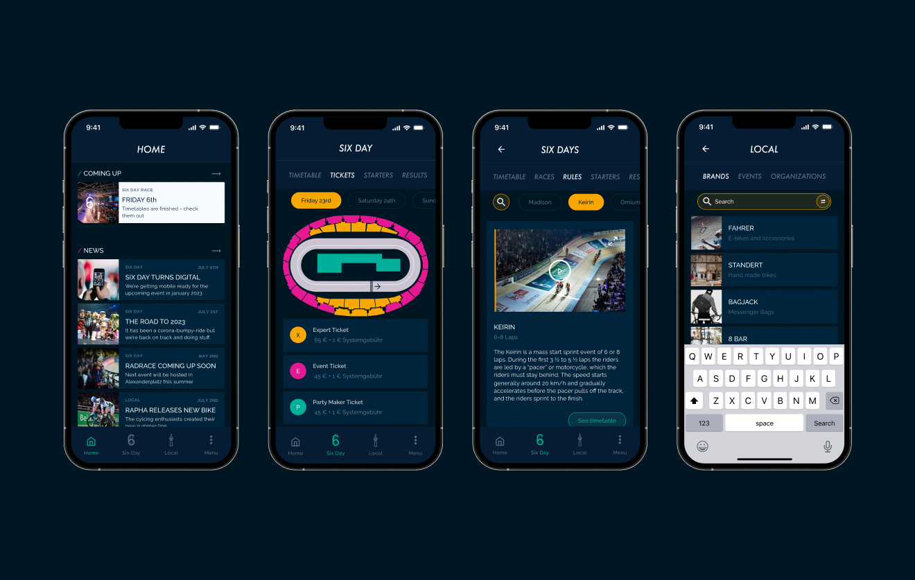
Before (left) / After our design collaboration (Right)
© Six Day Berlin
What does the digital landscape for events look like?
We wanted to get a clear picture of the digital solutions our primary users utilize for sports but also music festival events. We gathered input from Subject Matter Experts to inform our concepts. For a better understanding of their motivations, obstacles, and behaviour we conducted both qualitative and quantitative research. That's how we analysed and outlined must-have features.
Quantitative Data
"
A good experience with technology – either in or out of the stadium – has a positive knock-on effect in terms of overall engagement with the event.
Capgemini Report, Emerging Technologies in Sports, 2019
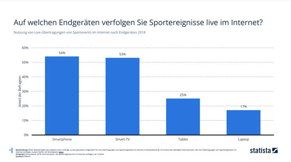
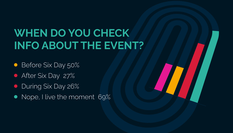
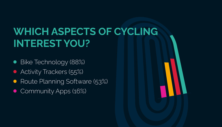
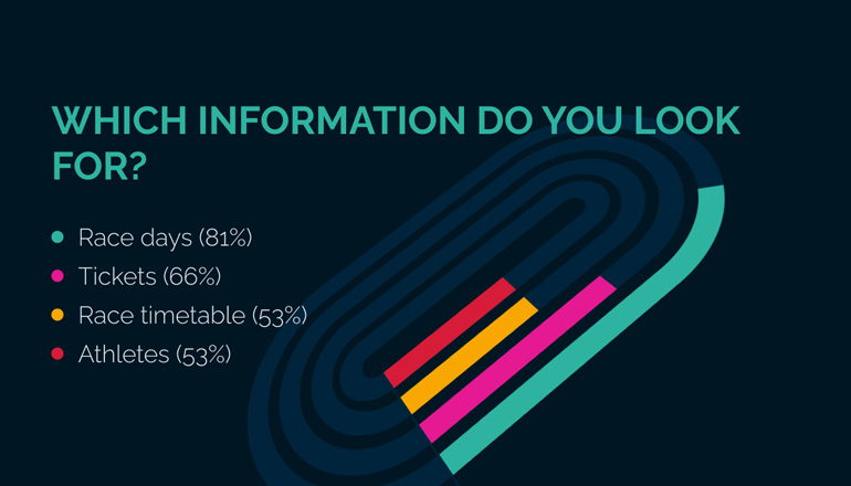
Online Survey
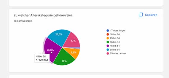
With a Lean Survey Canvas that we created, we reached out to the Six Day Berlin mailing list. 287 subscribers answered our questionnaire giving us reliable insights about their general attitude towards cycling, their personal interest in track cycling, and their current behaviour with the Six Day event.
© Six Day Berlin
With a clear interview script, we met with 20+ interviewees. The enlightening conversations enabled us to classify the primary takeaways into 4 distinct categories:
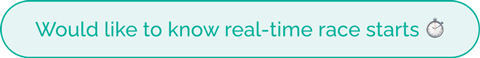
Real-time race tracking for all events.

Easy discovery of local bike content.

Social connection with fellow cycling enthusiasts.

Centralized learning hub for all race disciplines.
Through the patterns that emerged from our research, we tracked down two user profiles based on their goals and tasks.
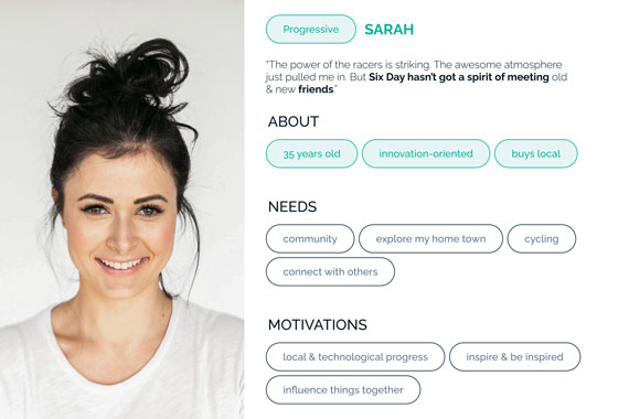
//// Klaus & Sarah
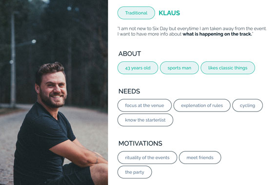
Problem Statement - Klaus
Klaus needs a way to get information before the event on his sports interests so he doesn't miss the action while attending the event.
Problem Statement - Sarah
Sarah needs a means to meet with interesting local sports creators so that she can remain engaged with the community.
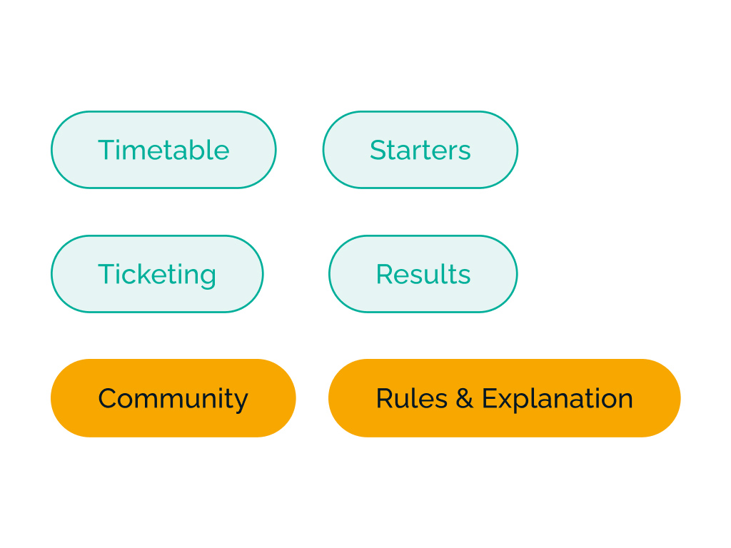
Brainstorming the features. We brainstormed and started to prioritise features based on impact and effort. We created a baseline with standard features such as a timetable, starters list, ticketing and a results overview.
Methods and tools we worked with:
Worst possible idea, trigger cards, Impact Matrix, MoSCoW.
Things people do
Low- & Mid-Fidelity Testing
The information architecture and low-fi concepts were developed for primary use cases. We designed and tested 7 task flows with mid-fi prototypes, each brainstormed by a team member.
After starting usability testing with the mid-fidelity mock-ups, we proceeded to digitise the designs once we were satisfied with their effectiveness.
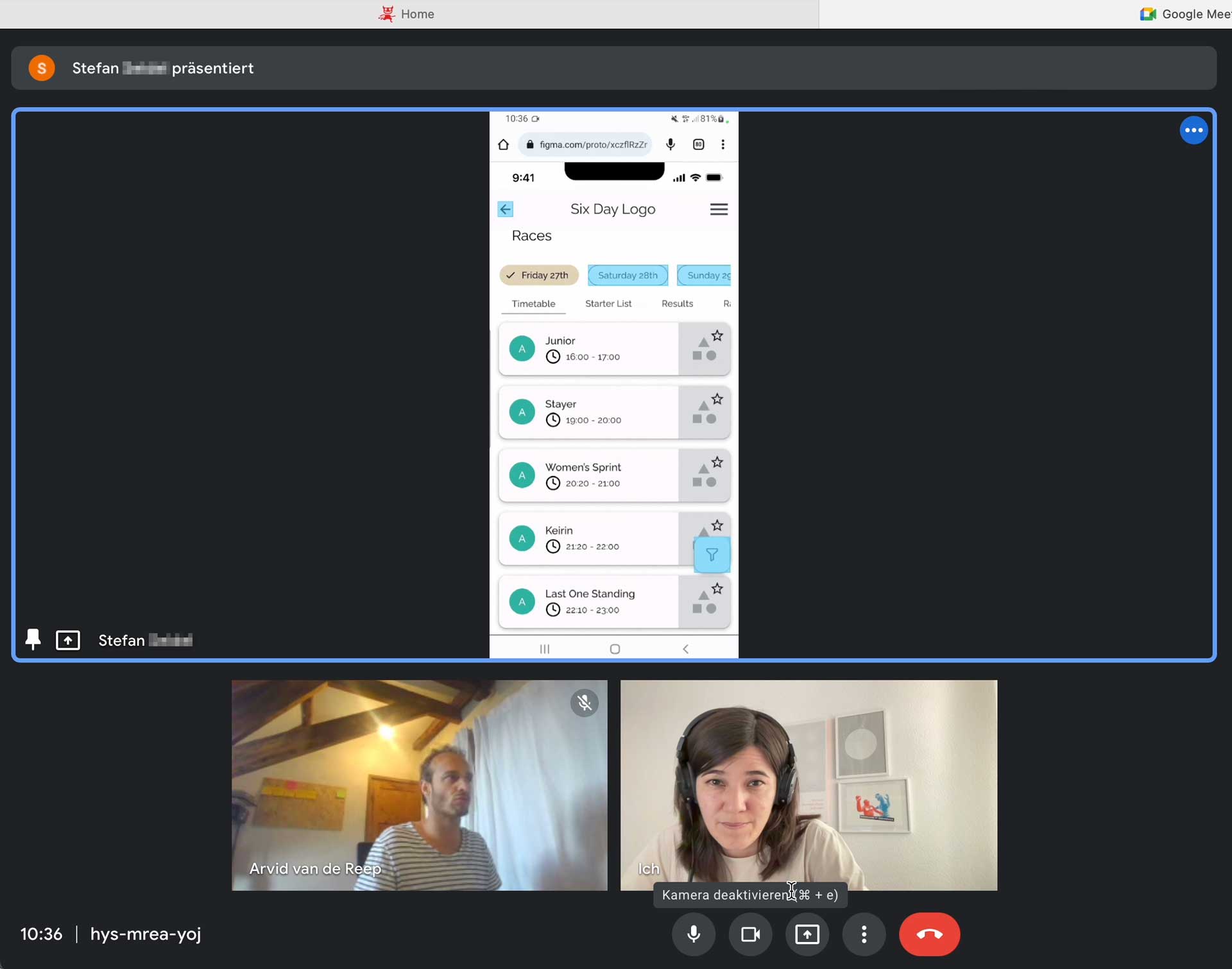
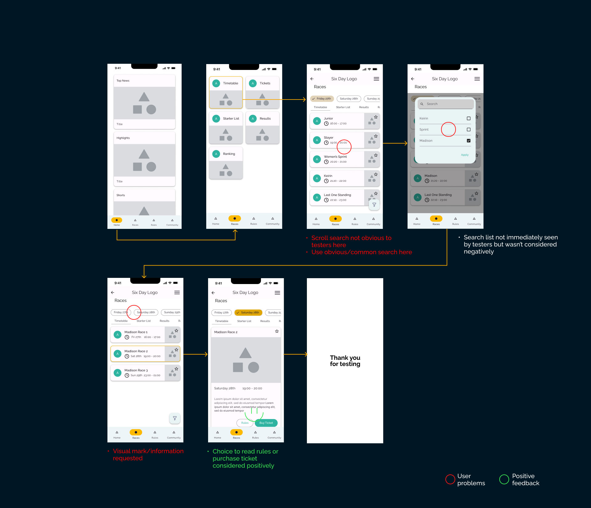
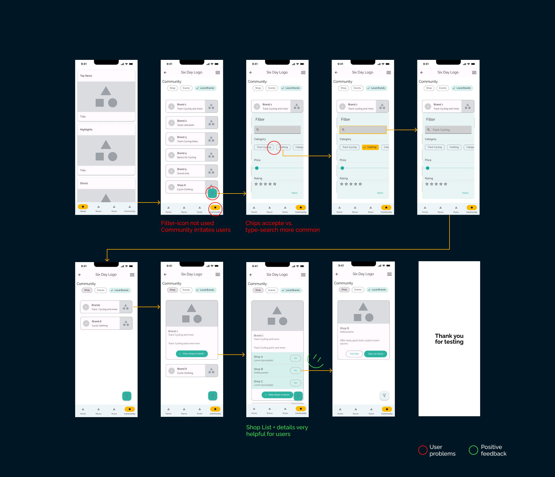
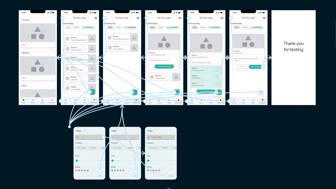
Virtual User-Tests
What really "sucks" in test round 1 & test round 2
Our Design Decisions
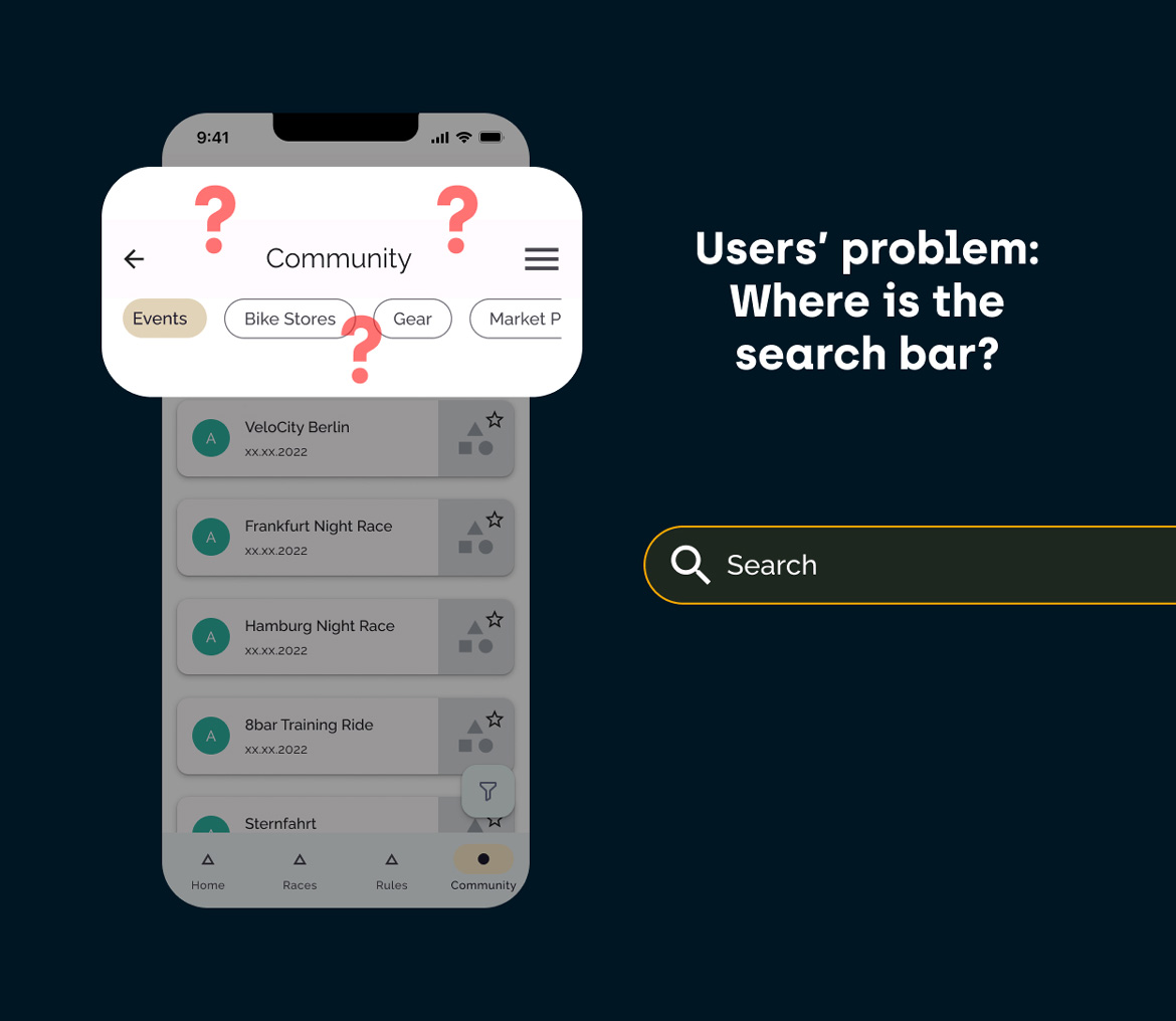
Initially, we had designed a two-level menu using tabs and search filters e.g. the race rules search.
Testers gave positive feedback but requested a search bar. They were used to and trusted the search bar which we added later.
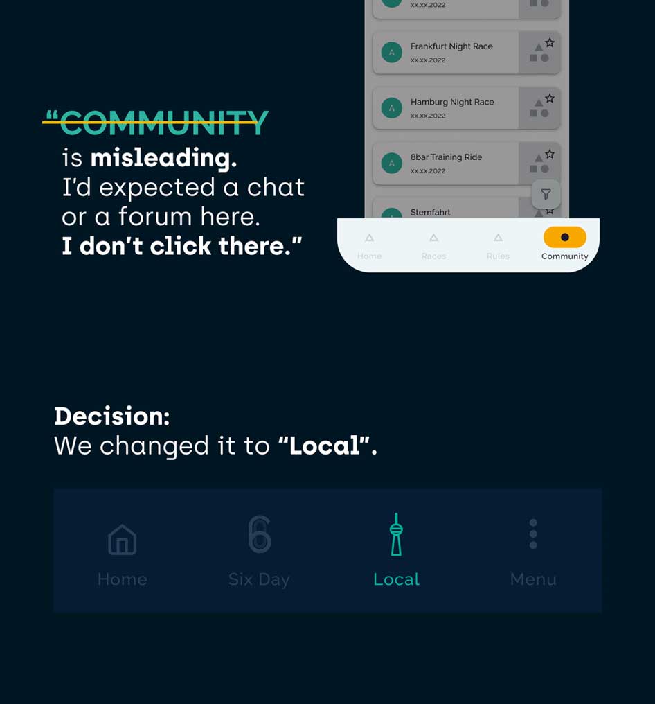
We learned how crucial the use of common terms is. Our testers were confused by the term "community" in the navigation bar. They thought it referred to a channel for cycling experts. It stopped them from using it. We replaced the term with "local" and paired it with an icon of the Berlin TV tower, a renowned landmark.
Refine the existing Six Days design system with respect
Based on the company's existing design system for print media, we had a good starting point for us. In the project's discovery phase, we identified available touchpoints within the business ecosystem.
We decided to stick to the primary brand colours for consistency. By having a style guide, Six Day now has a reliable reference for any future designs or modifications to the existing app.
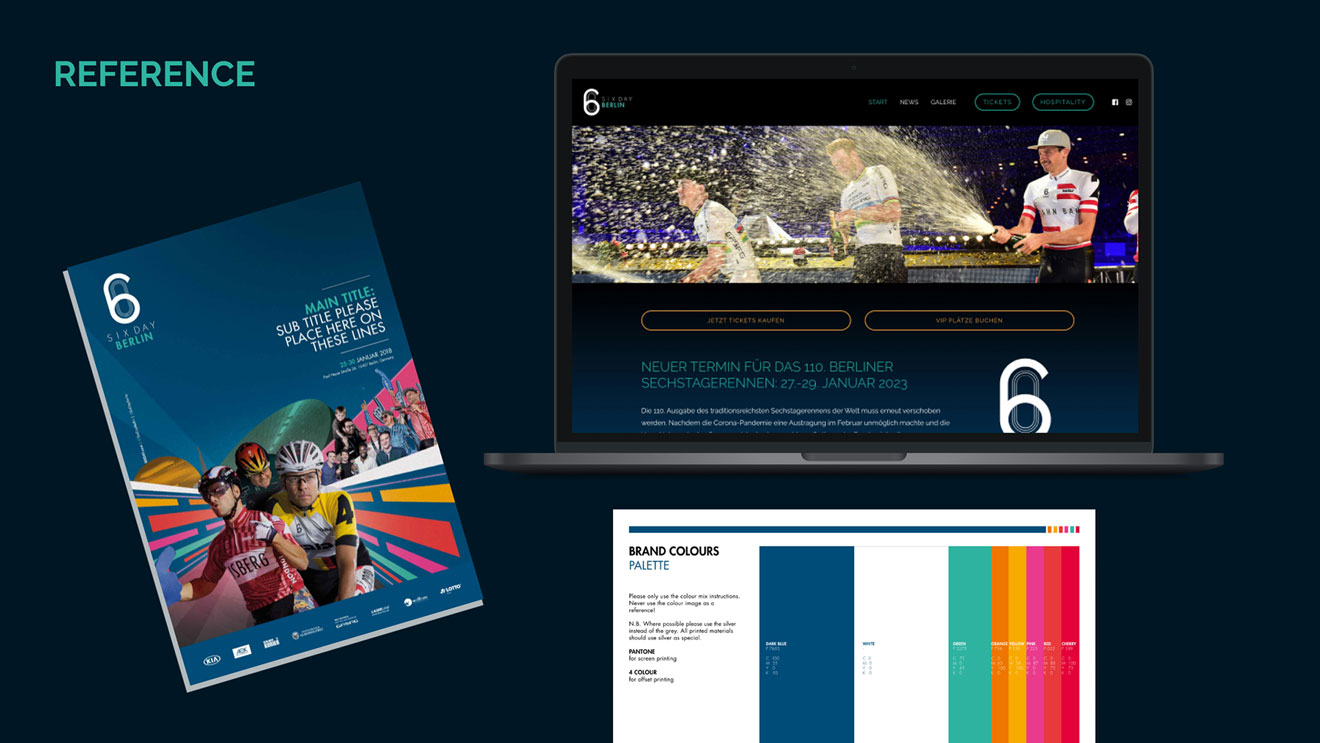
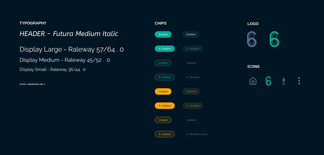
Slider showing the reference design system from Six Day and our developed design system © Six Day Berlin
Slider showing the reference design system from Six Day and our developed design system
COLOURS
Primary
#2EB3A1
#F7A700
COLOURS
Background
#001623
#00243B
#004876
#F5FBFF
Our Design Decisions
Colours
To maintain consistency, we utilized the existing primary brand colors of orange and green for buttons, chips, and titles. Monochrome tones were derived from the former dark blue gradient background to establish a visual hierarchy among the various components in our final design.
Font
The clean and modern style of the chosen fonts ensures excellent legibility for users as confirmed by our testers.
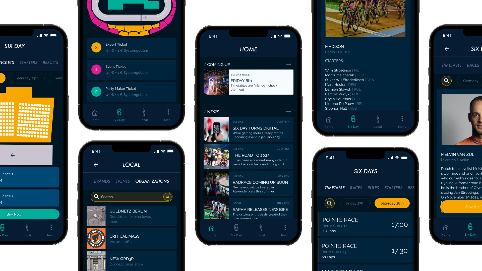
Grand Final
After several tests and iterations, we arrived at a final design for the Six Day App. Our aim was to represent reality in the app as accurately as possible, featuring a clear and organized layout that allows for easy user interaction. The design is high in contrast and consistent with the event's overall branding.
Sweet spots of the final design for Six Day Berlin
🔗 Connects users with the established Six Day event
🏆 Demonstrates product quality
👥 Adapts to diverse target audiences
☑️ Aligns with Six Day's new company direction
Valts Miltovics
CEO of Six Day
"
I'm drawn back by the high quality of results of Carla's, Arvid's, and Roberto's work. The app result matches Six Day's direction without them knowing it. I love it!
Rely on reality
Live is live. It's there, before our product. Welcoming it turns work into surprising fun. Users are the key drivers. Understanding them individually is crucial. I always remember to see all developments through the lens of the user.
Respect the design guidelines of the business
For the development of the application's visual identity we were given total freedom. We cared about relationships user's build to a brand and related it to SixDays' guidelines and design system.
The right content
The success of the local feature depends on the relevance of its content. Thus it demands special attention in the upcoming phase.
Universal Design System
Create a system to ensure the global reach of the Six Day race series in Europe, the UK, Asia, and Australia.
Light Mode
Offer light-mode for usage of the app outdoors.
Accessibility
Consider Web Content Accesibility Guidelines.
//// Thank you Roberto & Arvid for this boosting time!