Website User Interface | Case Study
ABOUT THE PROJECT
European Cycle Messenger Championship website refresh
The project brief tasked me with revamping the user interface design of an antiquated app or website into the contemporary realm. I chose the website for the European Cycle Messenger Championship. It needed some love and I gave it an overhaul. This case study outlines the power of visual storytelling and how it can greatly push the UX of a web page.
MY ROLE
UI Design
DURATION & DATE
2 weeks, April 2022
PROJECT TYPE
Individual
DELIVERABLES
Design System
Animated Prototype
The European Cycle Messenger Championship (ECMC) is a highly anticipated annual event that brings together cycle messengers from across Europe to compete in various cycling challenges. It's about showing the complexity of the delivery job. It's not just a race, it's a pulsating spectacle spinning around the smart alleycat abilities of cycle messengers, their strong unity and bringing their neat delivery skills into the limelight. With this project, I embarked on a mission to oil my user interface (UI) design sense.
The European Cycle Messenger Championship is known for its bold and individualistic nature. Its website hadn't been updated in a while. There were plenty of user pain points which needed to be addressed, such as confusing navigation, insufficient, scatted event-information and a user experience that was sure to leave visitors scratching their heads. My goal was to refresh a front-end design that captures the dynamic and one-of-a-kind framework of the event delivering a memorable experience to both the community and attendees.
"
Sometimes you need a ton of pictures forming some kind of motion to fully remember what it felt like.
Facebook post, ECMC 2016
From a user experience perspective, the website posed a more complex challenge than designing an app.
Taking on a website-scale project was a new experience for me. I was on fire to challenge myself to continue learning and staying adaptable.
Flashback & Flashforward
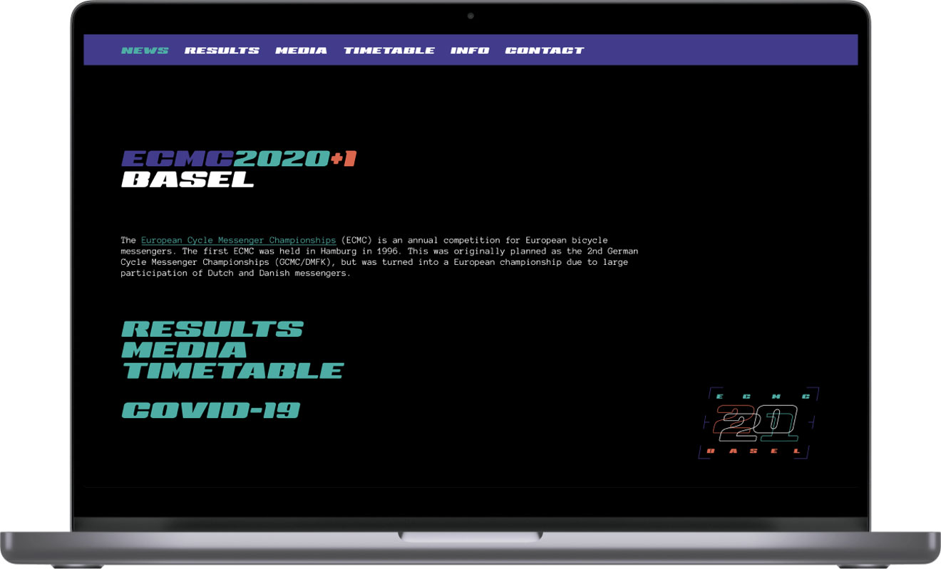
Left: Old web page © European Cycle Messenger Championship / Right: Revamped web page
"
Rather, they enjoyed the freedom of travelling through the city on their own terms, like a wheeled flaneur understanding the poetry of the sidewalk [...].
Edd Norval
Image © Sarah Moll
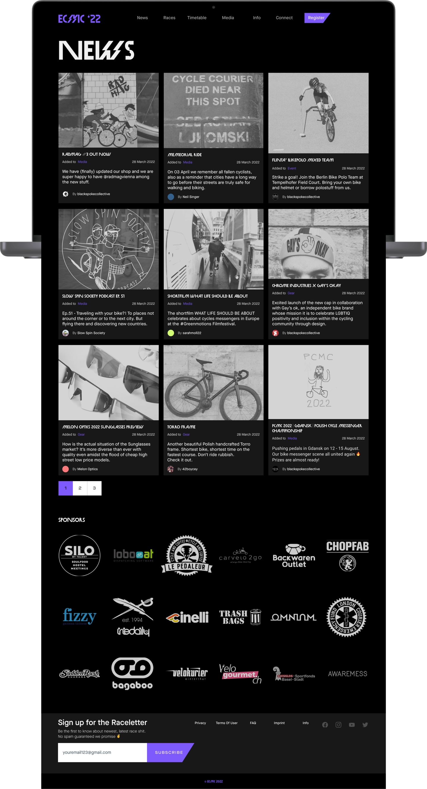
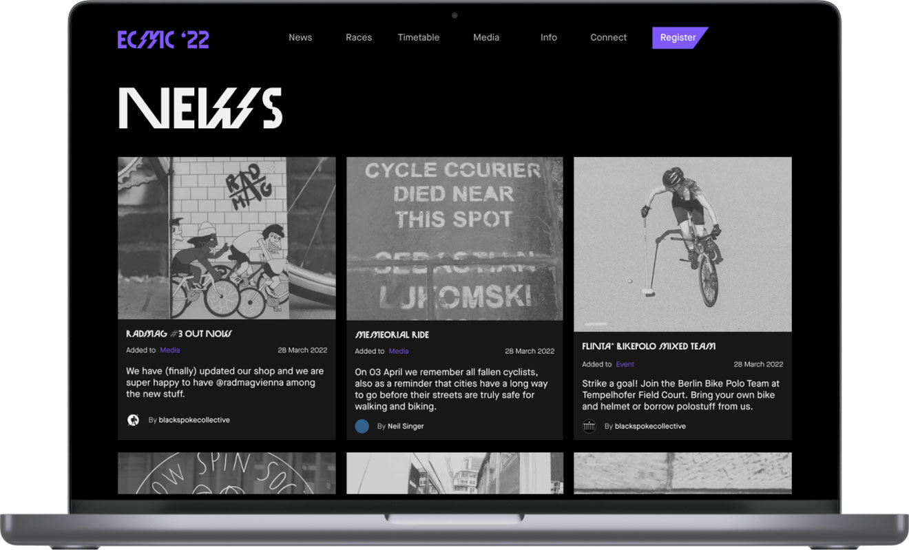
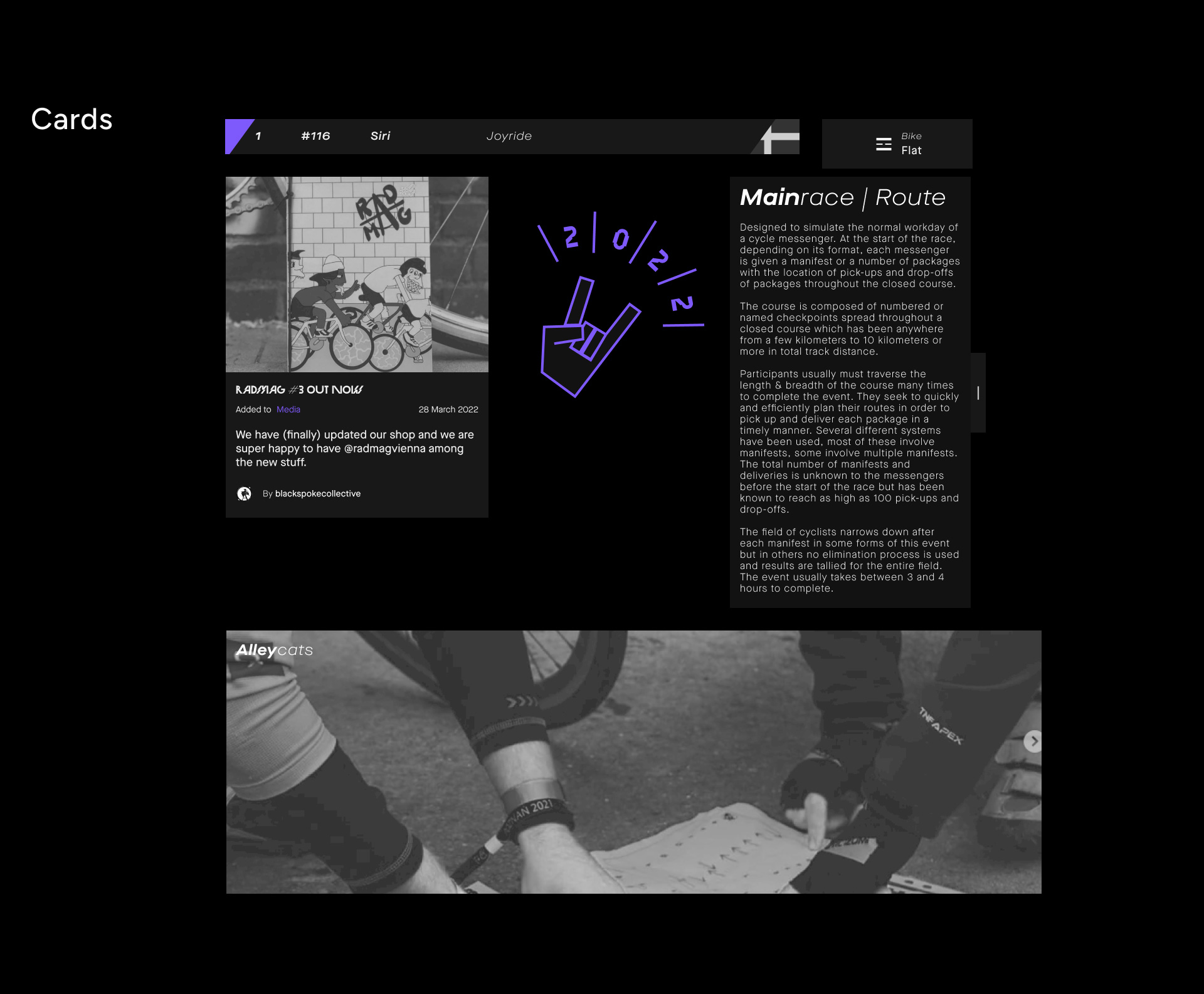
The website has a straightforward layout. The news feed appears on the homepage, accompanied by a concise header and cards, showing a variety of activities around the messenger scene. The main menu leads users to the major categories of the championship and to register.
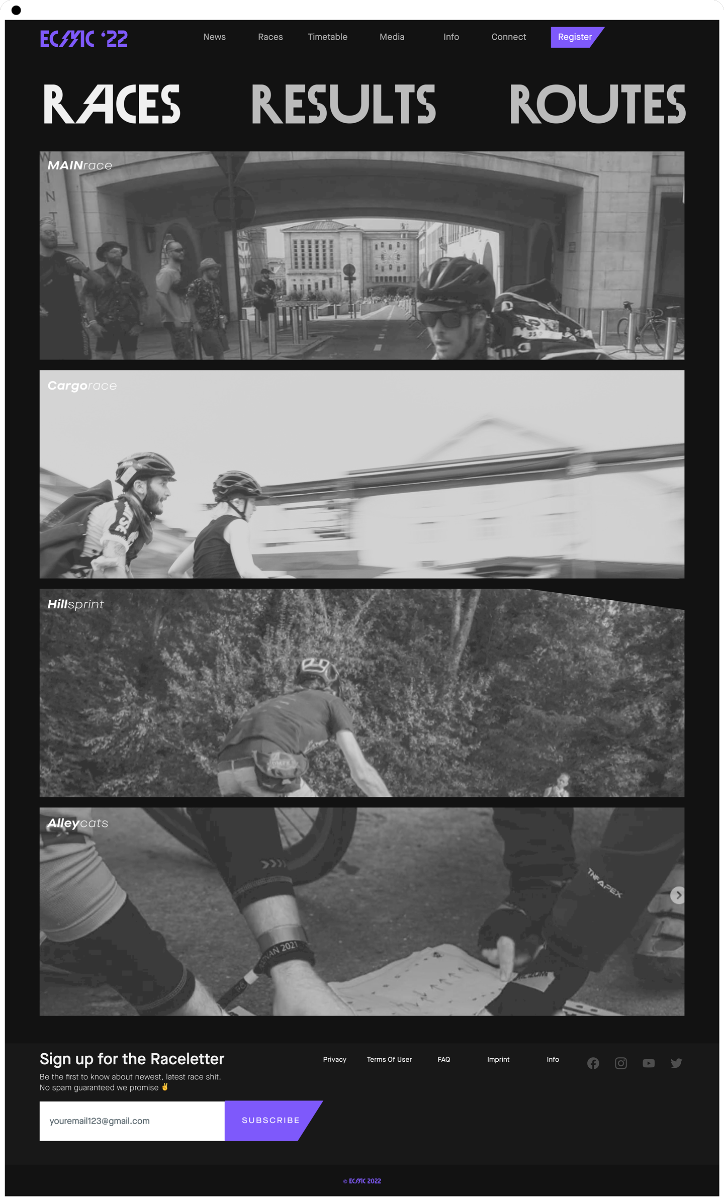
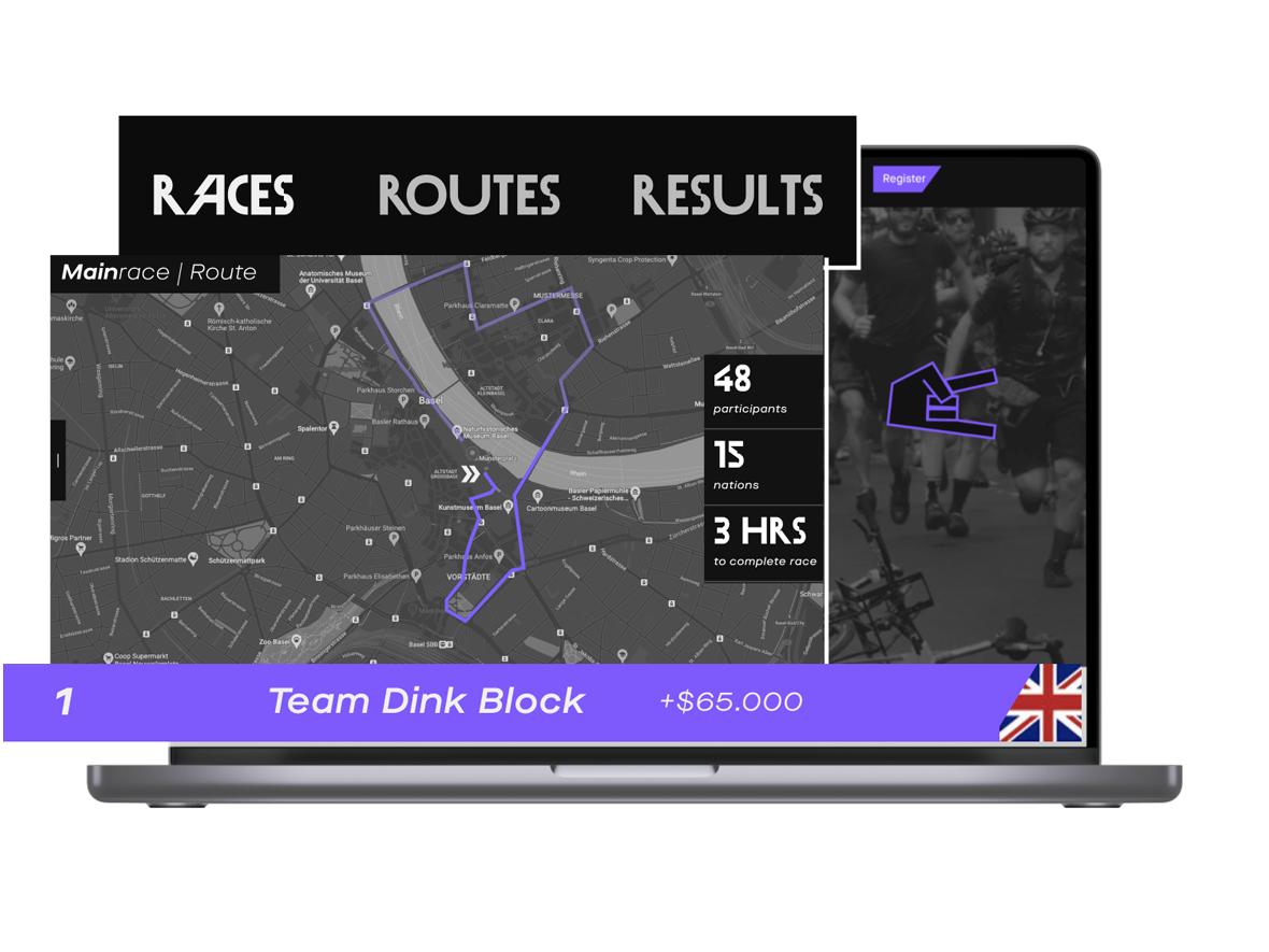
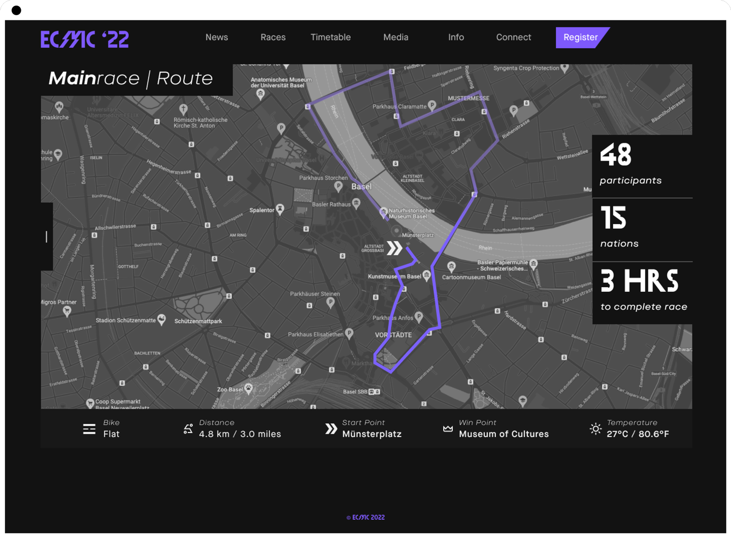
Race Route & Details
The digital face of the ECMC
In the first step of the redesign process, I researched the existing website and understood its pain points. It revealed an outdated design, poor user experience, and low usability.
"
[The cycle courier job] is totally complex. You have to think a lot & combine [checkpoints]. It's about being smart.
Insa Schäfer, ECMC Bremen organisational team
A brand's identity is the foundation of how it communicates with the world. This is the fun part, cracking the code on the ECMC's authentic brand attributes.
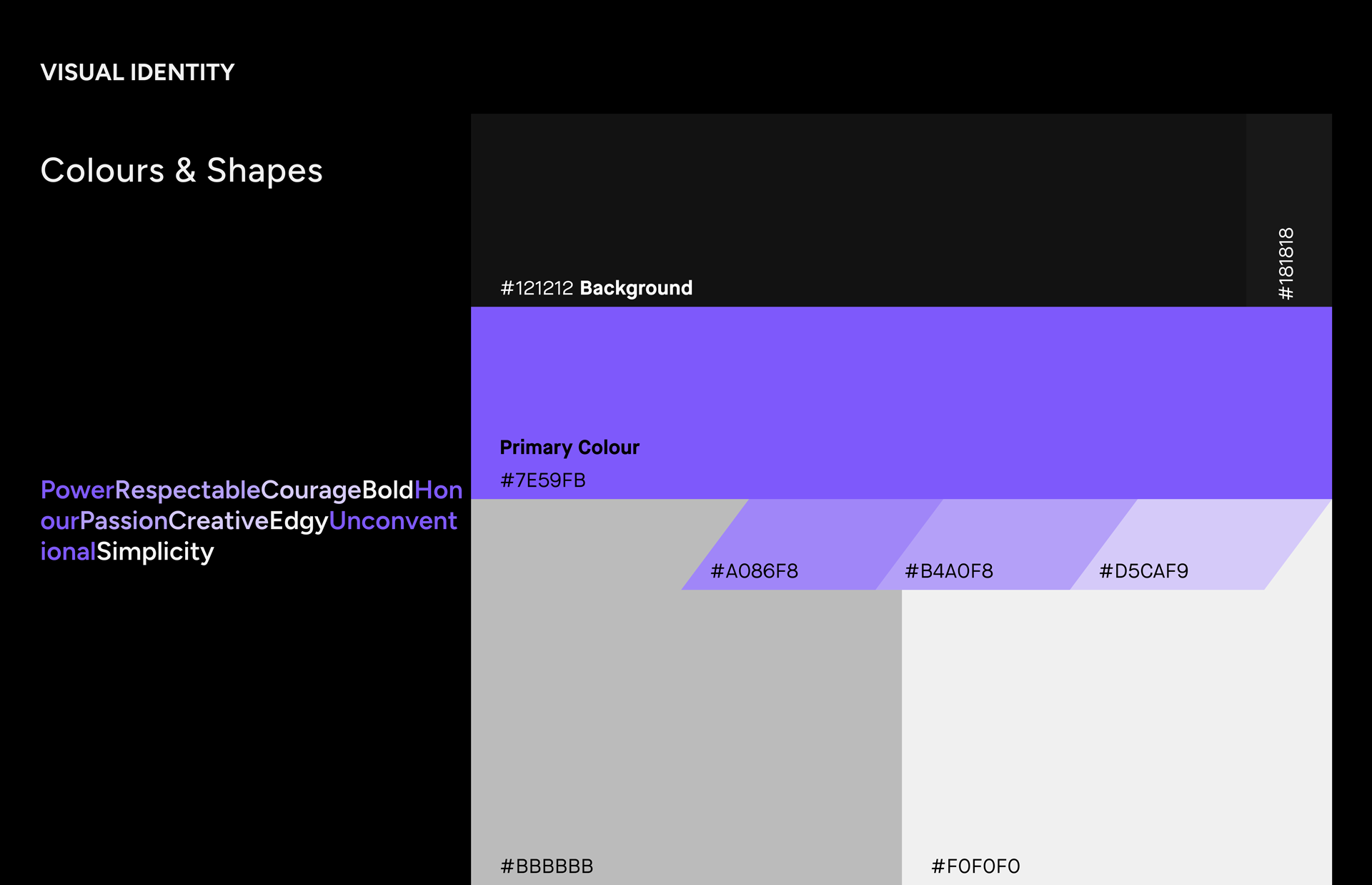
The European Cycle Messenger Championship has a vibrating and down-to-earth feel to it. I crafted a narrative with the colours and shapes below that put the light from speed and agility to community and excitement—playing around with the typography I chose to combine three fonts.
Finding the ideal art direction resonating ECMC
Spending some time experimenting in Figma I began developing an essential style guide to use as a reference. The palette of colours displayed below is limited to varying tones of black and grey to emphasize the visual elements and purple lead elements. I avoid utilizing pure black because it may appear too stark. To maintain order and neatness, I established some specific regulations regarding the colours.
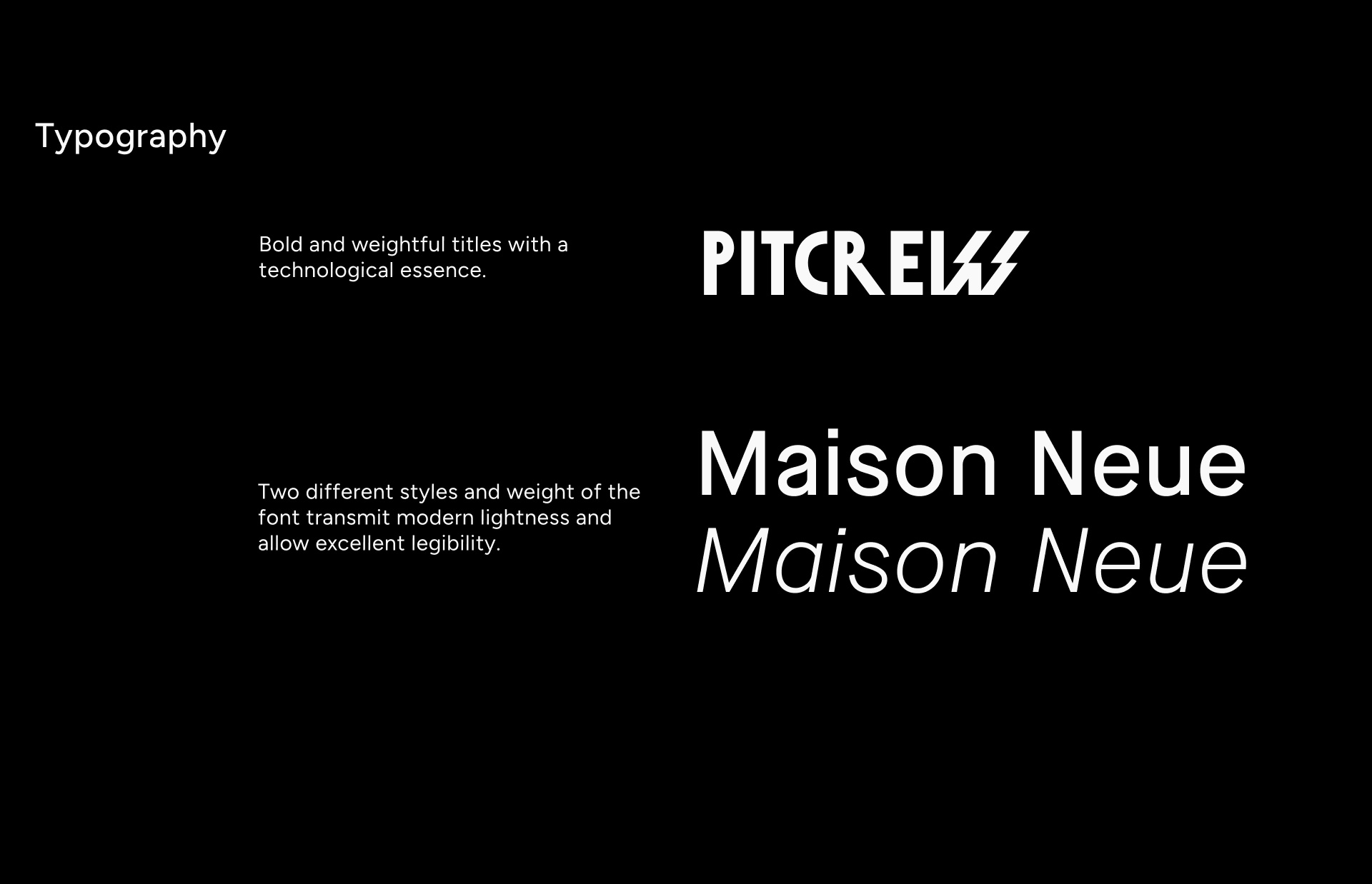
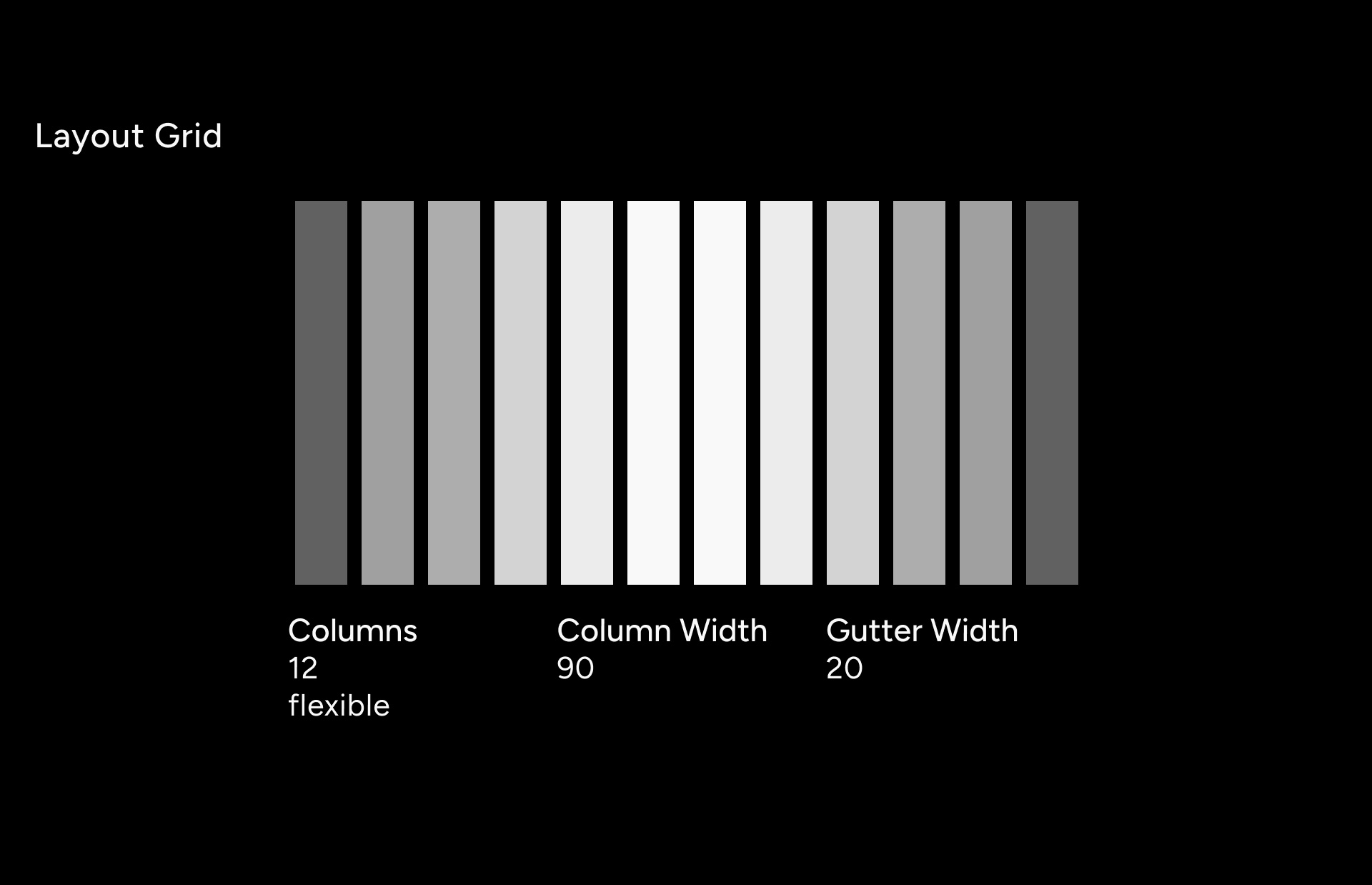
I aimed to convey a technical vibe through the typography while still ensuring legibility and aesthetic appeal. Thus, I opted to combine three fonts (displayed below). For the main titles, I selected the robust Pitcrew font, a non-serif typeface. To create a clear distinction between the titles and the content, I paired it with Maison Neue, a modern and clean sans-serif font. With my basic style guide and an eight-pixel grid, I started converting my initial sketches into digital pixels.
Flashing excitement already while loading
A race can be won or lost in the "flash of a moment". Working literally with flashy animations on my web design is anything but dull. The main goal of the website design is to embody the vibrant atmosphere of the European Cycle Messenger Championship. To achieve this, I animated the logo and edgy graphics providing visitors with a sneak peek into the energy and thrill of the event.
Pulse-animation of the loader
Surprising navigation
Upon arrival, the page comes to life with a pulsating animation. The menu and content titles boast a captivating hover effect that transforms them from basic black-and-white to vibrant purple. It turns the images into a snazzy duotone display.
Winner's Glory
Hovering over the rankings lets users see the magic unfold and put the racers on a podium.
Redesigning the website was an absolute blast for me, as I relish playing with contrasting aesthetics and unexpected effects.
The website as a stage
At the ECMC the bold racers are the stars. I envisioned a platform as an alluring stage catering to fans and spectators. The web page beckons users to join in to amplify the excitement of the experience.
Reach users through clarity
Effortless UI elements with straightforward navigation for race information were modelled to balance legibility and elegance. Typography and effects stole the show in this masterpiece, which was a fantastic treat.